You open Apple Health after a rough morning and the graph looks like a storm line, spikes, dips, and long stretches that seem to mean everything and nothing at once. If you live with POTS, unexplained tachycardia, or palpitations, that feeling is normal. The hard part isn't collecting heart rate data, it's learning how to interrogate it so you can tell your doctor what happened.
Why Your Watch Data Feels Overwhelming
Raw watch data is a stream, not a verdict. A line chart can show every beat-per-minute sample your watch captured, but it won't tell you whether the spike happened during a walk to the kitchen, after standing up, or while you were already recovering from an earlier event.
From readings to episodes
Heart rate data analysis turns that stream into something useful by separating measurement, episode qualification, context, and reporting. That matters because a clinician rarely needs every single sample. They need the story of a rise, how long it lasted, what else was happening, and how confident you are in the record.
Practical rule: if a chart raises more questions than it answers, the data still needs processing.
The gap between collection and analysis is where most confusion starts. Apple Health is good at storing history, but it wasn't built to label orthostatic episodes, exclude exercise noise, or explain why one spike matters more than another.
A clearer workflow asks four questions in order:
- Is the signal trustworthy? Clean out obvious noise before you interpret anything.
- Did a real episode occur? Check rise size, duration, and timing.
- What else was true then? Add symptoms, posture, hydration, sleep, and medication context.
- Can a clinician read it fast? Package the result into a short, auditable summary.
That structure keeps you from mistaking a busy graph for a diagnosis. It also gives you a way to move from “my watch says something happened” to “here's the episode, here's the context, and here's why I think it matters.”
Knowing What Your Watch Measures Accurately
The first mistake in heart rate data analysis is treating every metric as equally solid. That's not how wearable signals behave. Some values are much more stable than others, especially once motion enters the picture.
What you can trust first
A 2025 validation study comparing Apple Watch Series 6 readings with a three-lead Biopac ECG found near-perfect agreement for resting beats per minute and R-R intervals in healthy adults, with mean absolute percentage error for BPM at 1.15% during rest and reported BPM errors ranging from 1.16% to 6.46% across tested conditions. The same study found that N-N interval estimates were far less stable, with resting mean absolute percentage error around 31.31% and values reaching 93.08% under other conditions, so the authors supported the watch for BPM and R-R interval measurement but urged caution with more specialized variability metrics. Those findings line up with a broader 2024 umbrella review, which found wearable HRV agreement with ECG-based methods at rest, with intraclass correlation coefficients generally between 0.85 and 0.99, while agreement dropped as exercise and motion increased. Validation and umbrella review details
A simple reliability map
| Metric | Rest Reliability | Motion Sensitivity | Safe to Interpret Passively? |
|---|---|---|---|
| Beats per minute | Strong | Moderate to high | Yes, with context |
| R-R interval | Strong at rest | Higher during movement | Mostly, if signal quality is clean |
| HRV-derived features | Variable | High | Use cautiously |
| High-frequency variability | Less stable | Very high | Not by itself |
That's why the safest episode logic starts with timestamped BPM, baseline-to-peak change, duration, and activity context. Those are the parts of the signal most likely to survive ordinary real-world use. A readable overview of how watch data can be interpreted in practice is also available in this Apple Watch heart rate accuracy guide.
Bottom line: trust the simple measurements first, and treat derived variability features as higher-uncertainty signals unless the context is clean.
Preprocessing the Stream Before You Trust a Single Spike
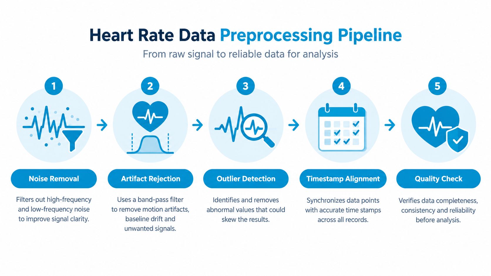
A spike means very little until the underlying record is cleaned. That's why the first pass should always remove obvious errors, not explain them away.
Clean the record before you count anything
Start by removing implausible values, duplicate timestamps, and gaps that make the timeline unreliable. Then flag workouts and the recovery window that follows, because exercise can inflate counts in a way that has nothing to do with orthostatic symptoms. If you don't know what was excluded, your episode total is still a guess.
Next, estimate baseline from a stable statistic instead of a single reading. A median from several minutes is usually safer than the first sample you happen to see, because one ectopic beat, one motion artifact, or one brief sensor hiccup can tilt a narrow baseline in the wrong direction. Preserve missingness rather than filling every hole, because a smooth-looking record can hide weak data.
The threshold used in many POTS workflows is a 30 bpm rise within 5 minutes, but that's only a working rule, not a diagnosis. The value of the rule is that it gives you a consistent starting point for screening. The danger is that a simple rise can still reflect posture transitions, recent activity, or incomplete data if you don't apply the rest of the filter.
If you want a compact mental model, use this order:
- Remove bad samples.
- Exclude exercise and recovery.
- Set a steady baseline.
- Measure the rise against time.
- Keep a record of what was removed and why.
A transparent report about false positives is especially useful, which is why many readers pair this workflow with the guidance in false-positive reduction strategies. The point isn't to suppress events. It's to keep the right events and defend them later.
Qualifying a Tachycardic Episode Beyond a Peak Number
A peak number alone can fool you. Two people can show similar heart rate rises and have very different explanations, one orthostatic and one moving around. That's why episode qualification has to ask more than “How high did it go?”
What makes an episode real enough to keep
A qualified episode should include how large the rise was, how long it stayed high, whether it occurred inside the intended standing window, and whether the baseline was valid. If the time window is fuzzy, the episode isn't strong enough to rely on. If the baseline was already unstable, the peak might be less meaningful than it looks.
A 2025 wearable study of heart-rate response after getting out of bed showed substantial person-to-person variation even among healthy controls, with mean increases ranging from 6.60 to 27.02 bpm, and in people with hypermobile Ehlers-Danlos syndrome from 8.15 to 27.71 bpm. The same study also showed different average step counts, 64 in controls versus 27 in the hEDS group, which is a reminder that activity itself changes the shape of the response. The lesson is simple, magnitude alone doesn't separate a meaningful orthostatic event from ordinary movement. Wearable orthostatic response data
Ask for persistence, not just a blip
A real episode should usually persist long enough to survive brief noise. If the heart rate jumps, then immediately falls, that may be a sensor artifact, a posture transition, or a short-lived response that doesn't belong in the same bucket as a sustained orthostatic episode.
A clinician trusts a qualified episode more than a hundred unlabeled spikes.
That's also why a good record preserves baseline, peak, rise magnitude, duration, data completeness, and activity context. A binary yes/no label is too thin for review. A clinician-facing record should show enough detail to let someone judge the episode without needing to reconstruct it from scratch.
Linking Symptoms, Triggers, and Context to Each Episode
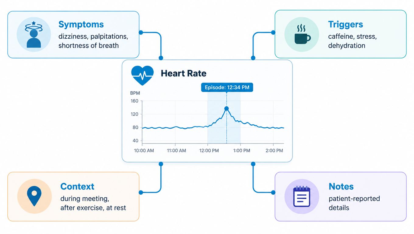
A heart rate rise without context can't tell you much. A heart rate rise with symptoms, sleep, hydration, and medication timing starts to look like a pattern your clinician can work with.
The story around the spike matters
Think about a week in plain language. Tuesday morning brings a cluster of episodes after poor sleep and skipped salt. Thursday stays calm. Friday spikes again after a medication change. The numbers alone don't prove cause and effect, but the tags make the pattern visible.
That's why symptom logging should stay simple and consistent. Record dizziness, palpitations, fatigue, and brain fog in the same place every time. Then pair each entry with likely triggers such as hydration, salt intake, sleep quality, medication timing, and whether the episode happened at rest or after standing.
Build a searchable record, not a diary
A good log answers three questions quickly:
- What did you feel? Use short symptom labels.
- What changed around the event? Note food, fluid, sleep, and medications.
- What was happening physically? Add posture, activity, and recovery notes.
That structure reduces the need to re-explain the week in the exam room. It also helps you avoid the common trap of treating every high BPM reading as equal. If one event came with dizziness after standing and another followed a stressful commute plus poor sleep, those are not the same story.
For a practical place to keep that context attached to the episode itself, some patients use structured episode logging inside apps such as Cardiogram, which can link symptoms and triggers to tachycardic episodes while keeping the emphasis on the event, not just the number. The useful idea here is not the brand, it's the method, because linked context is what makes the data searchable later.
Reading Trends, Weekly Summaries, and Episode Heatmaps
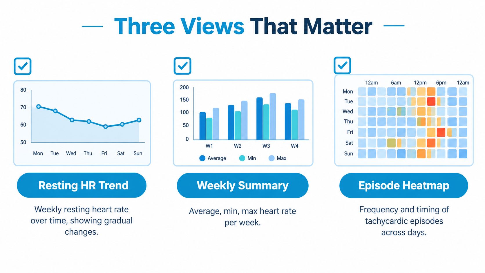
Once the events are qualified, the next question is where the pattern lives. Some patterns are obvious only in a trend line. Others show up in a weekly summary. The timing pattern often only appears in a heatmap.
Each view answers a different question
A resting heart rate trend shows whether baseline behavior is drifting over weeks. That helps when you want to know whether your overall state is changing, not just whether one day was rough. A weekly summary helps you compare episode count and average episode size without getting distracted by every point on the graph.
An episode heatmap is different. It shows when events cluster across days and times, which is often where the clinically useful pattern hides. Morning orthostatic spikes, post-meal clusters, or late-afternoon crashes can all disappear in a line chart but stand out in a heatmap.
Use the right lens for the question
If you're trying to answer whether things are gradually worsening, use the trend. If you're trying to compare one week to another, use the summary. If you're trying to understand timing, use the heatmap.
A quick checklist helps keep you honest:
- Trend view: look for drift, not single spikes.
- Weekly summary: compare burden across weeks, not isolated peaks.
- Heatmap: inspect timing clusters, not average values.
Those three views together are more useful than a long scroll through raw samples. They turn a confusing timeline into something your doctor can scan in seconds and ask about with purpose.
Producing a Clinician-Ready Report and Keeping It Private
A good report is short, structured, and explicit about its rules. It should show the clinician what happened, what was excluded, and why the remaining events deserve attention.
What to put in the report
Start with the detection criterion you used, then list the episodes with baseline, peak, rise magnitude, duration, and time of occurrence. Add a weekly trend and a heatmap so the report shows both burden and timing. Then include the symptom and trigger notes linked to each event, because the context is often what makes the difference between a vague concern and a usable clinical story.
Keep the exclusions visible. Show workout and recovery windows, because hidden filtering makes a report hard to trust. Add representative time-series context rather than only binary alerts, so the reader can see how the episode unfolded instead of guessing from a label.
Make the report readable in one sitting
A clinician doesn't need every sample. They need a tight summary that preserves uncertainty and makes the method clear. A concise exportable format is especially useful when the report can be customized to show the exact rule used, the episode list, and the supporting trends, which is the kind of output described in this report customization guide.
Show the rule, show the exclusions, and show the context.
Privacy matters too. A workflow that runs on device with read-only Apple Health access and syncs only through the user's own iCloud keeps the analysis inside the patient's ecosystem instead of sending it elsewhere. That makes it easier to share the summary with a clinician without creating a separate data trail you don't control.
If you want a cleaner way to turn Apple Watch readings into episode-level evidence, context, and a report your clinician can scan, visit Cardiogram. It's built to help you separate real tachycardic episodes from motion, recovery, and noise, then package the result into something useful for a POTS or dysautonomia appointment.