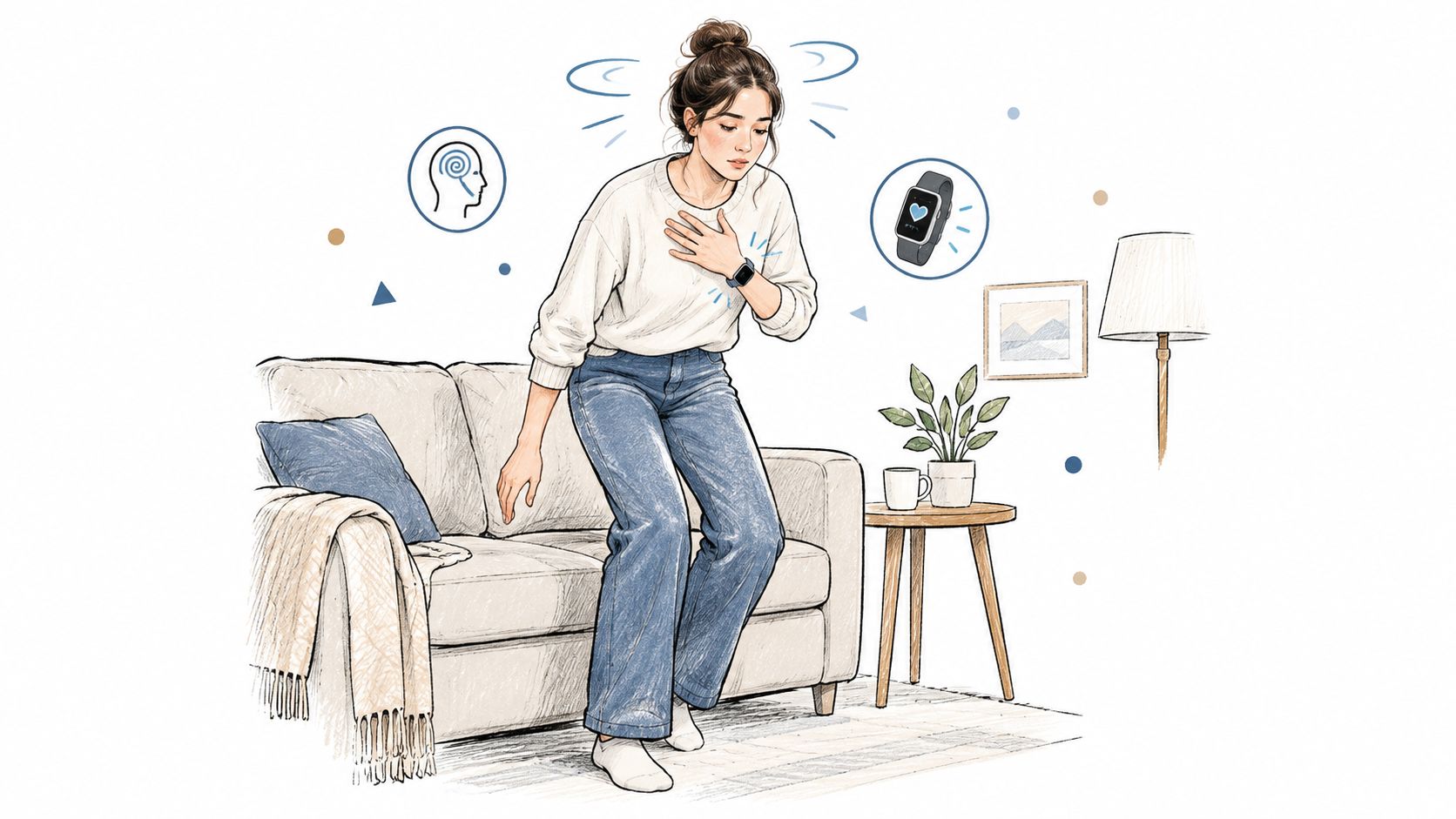
You stand up from the couch, take three steps, and suddenly feel that familiar wave. Lightheaded. A little shaky. Maybe your heart feels like it sprinted ahead of the rest of you. By the time you sit back down and think, “I should check that,” the moment has already changed.
That's where wearable health monitoring starts to matter in everyday life. Not because a watch can diagnose what happened in that instant, but because it can keep a quiet record of what happened before, during, and after it. For people dealing with POTS, dysautonomia, unexplained tachycardia, or recurring dizziness, that timeline is often more useful than one isolated number.
Wearables became mainstream fast. Estimated U.S. adult use of wearable devices for health or activity tracking rose from 67,292,423 in 2019 to 106,560,954 in 2024, a 58% increase over that period, according to this U.S. wearable adoption analysis. That shift changed wearables from a novelty into a large, ongoing source of repeated health measurements.
Introduction to Wearable Health Monitoring in Everyday Life
A lot of people first think of wearables as step counters. That's understandable. Early conversations around watches and bands focused on activity rings, workout streaks, and daily movement goals.
But wearable health monitoring is bigger than step counting. It's really about collecting many small observations over time. A clinic visit gives a snapshot. A wearable gives a sequence. If your symptoms come and go, that difference matters.
Why timing changes the whole story
Say your heart rate jumps after standing. If that happened in a doctor's office, someone might catch it. If it happened in your kitchen, during a grocery run, or after a bad night of sleep, it might never show up in a formal setting.
That's why passive monitoring feels so different. The device doesn't wait for the “right” moment. It keeps watching ordinary life unfold.
Single moments are easy to miss. Patterns are harder to ignore.
For people with orthostatic symptoms, the useful question usually isn't “What was my heart rate once?” It's closer to, “What tends to happen when I stand up, how long does it last, and what else was going on that day?”
What wearables can and can't promise
A watch can notice signals. It can summarize change. It can help you connect symptoms with timing, posture, hydration, sleep, and daily routines. What it usually can't do on its own is explain the cause with certainty.
That distinction helps avoid a lot of confusion. Many readers expect a wearable to behave like a lab test. Most of the time, it works better as a context engine. It gathers repeated clues so you and your clinician can review the story, not just the headline.
A 2023 NIH and NHLBI summary reported that almost one in three Americans uses a wearable device for health and fitness tracking, and more than 80% of wearable users said they would share device data with their doctor to support health monitoring. The same summary also noted a large research footprint for wearables in health studies and broad global use of smartwatches for health information. You can read those findings in the NIH and NHLBI overview of wearable device trends.
How Wearable Health Monitoring Actually Works
A wearable works like a quiet observer on your wrist. It notices raw signals, cleans them up, and turns them into something you can read on a screen. That basic loop matters more than any marketing label.
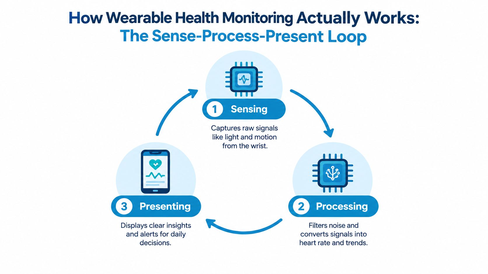
Sense first, understand later
Your device doesn't begin with “You are dizzy” or “This is a POTS episode.” It begins with simple inputs.
An optical sensor shines light into the skin and detects changes related to blood flow. A motion sensor notices when your wrist and body are moving. The device may also use timing, posture clues, and recent activity to interpret what kind of moment it's observing.
Listening to an orchestra from outside the concert hall. At first you just hear sound. Then you separate the violin from the drums. Then you recognize the song.
The middle step is where most confusion happens
People often treat the number on the screen as if the sensor measured it directly and perfectly. That's not quite how it works. The device collects raw material, then software filters out some noise and estimates a heart rate or trend.
This is why context matters so much. A reading taken while you're lying still is easier to interpret than one taken while carrying groceries, adjusting your sleeve, or climbing stairs. The signal may be real, but the confidence around it changes with motion and conditions.
Practical rule: The more a wearable has to guess through noise, the more you should rely on patterns instead of one reading.
Presentation shapes what you notice
After sensing and processing, the device presents information in a form you can act on. That could be a live heart-rate display, a graph, an alert, or a summary of repeated episodes.
A simple app view might show:
- Current pulse: Useful for quick awareness in the moment
- Daily trend: Better for seeing whether symptoms cluster at certain times
- Episode summary: More helpful when you need to review sustained changes rather than scattered spikes
- Context notes: The missing piece that explains whether you had just stood up, exercised, skipped fluids, or slept poorly
The presentation layer often determines whether data feels overwhelming or useful. Raw numbers alone can create anxiety. A filtered summary can create clarity.
Why continuous sampling beats memory
When you feel unwell, it's hard to remember exact timing. That's normal. Symptoms blur together, and details fade.
Wearable health monitoring helps by anchoring events in time. Instead of saying, “I think my heart was racing sometime this afternoon,” you can review whether the rise happened after standing, whether it settled quickly, and whether it repeated in a similar way later.
That time-linked context is where wearables start becoming clinically interesting, especially for conditions that fluctuate throughout the day.
Sensors Behind Wearable Health Monitoring and What They Measure
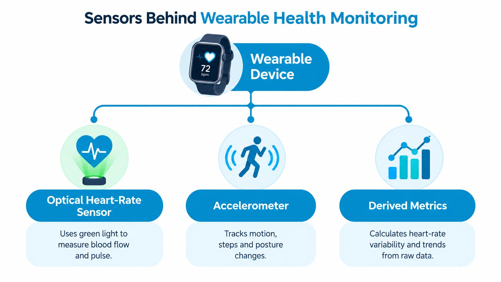
The easiest way to understand sensors is to separate direct signals from derived metrics. Some parts of wearable health monitoring come closer to raw observation. Other parts are built through calculation.
Optical heart-rate sensing
Most watches estimate heart rate using light. The device shines light into the skin and detects changes as blood pulses through small vessels. This method is convenient because it's passive and continuous.
That convenience comes with conditions. Wrist-based optical sensing tends to behave best when you're relatively still. It becomes harder when movement, loose fit, skin contact changes, or rapid transitions introduce noise.
A 2026 living systematic review and meta-analysis of Apple Watch heart-rate measurements found a small overall heart-rate bias of -0.27 bpm, but the limits of agreement were broad, from -7.19 to 6.64 bpm in the linked analysis, which means individual readings can still vary meaningfully even when average accuracy looks strong in aggregate. See the Apple Watch heart-rate accuracy review.
That's a big reason clinicians and careful users don't treat one wrist reading as final proof of what happened. The stronger use case is trend interpretation across time or during a defined episode.
Motion sensing and why it matters
The accelerometer tracks movement. That might sound unrelated to heart rate, but it's one of the key tools for interpretation. If heart rate rises during a workout, that means one thing. If it rises shortly after standing still from a seated position, that may mean something else entirely.
Motion data helps sort those situations. It can identify exercise periods, posture shifts, or noisy moments when the wrist signal needs extra caution.
If you want a simple explanation of the hardware and data flow behind these measurements, this guide on how the heart monitor works gives a practical walkthrough.
Derived metrics need more caution
Some outputs aren't measured directly. They're calculated from the raw signal. Heart-rate variability, or HRV, is a good example. It can be interesting, but it's often more fragile than basic pulse tracking.
A review of consumer-grade wearables reported resting heart-rate errors around 2 bpm with mean absolute percentage error below 10%, while a 2024 Apple Watch validation study found resting heart-rate error of 3.73 bpm and 5.91% MAPE compared with a chest strap reference. In the same study, HRV was much less reliable, with an average underestimation of 8.31 ms and 28.88% MAPE, according to the review on consumer wearable validity.
That doesn't make HRV useless. It means you should treat it as a softer signal, especially if you're trying to make daily decisions from it.
Sensor Signals and Reliability at a Glance
| Signal | What It Measures | Typical Reliability |
|---|---|---|
| Heart rate at rest | Pulse estimated from wrist blood-flow changes | Usually one of the stronger wearable signals when you're still |
| Heart rate during motion | Pulse estimated while movement is happening | More variable because motion can distort the optical signal |
| Accelerometer data | Wrist and body movement patterns | Useful for context, filtering, and separating exercise from symptom episodes |
| HRV | Variation between beats derived from pulse timing | Often noisier and more sensitive to signal quality |
Treat the watch like a reporter, not a judge. It records clues well. It doesn't settle every question on its own.
Consumer Fitness Tracking Versus Clinical Monitoring Needs
Fitness tracking and symptom monitoring can use the same device while asking very different questions. That's where many people get tripped up.
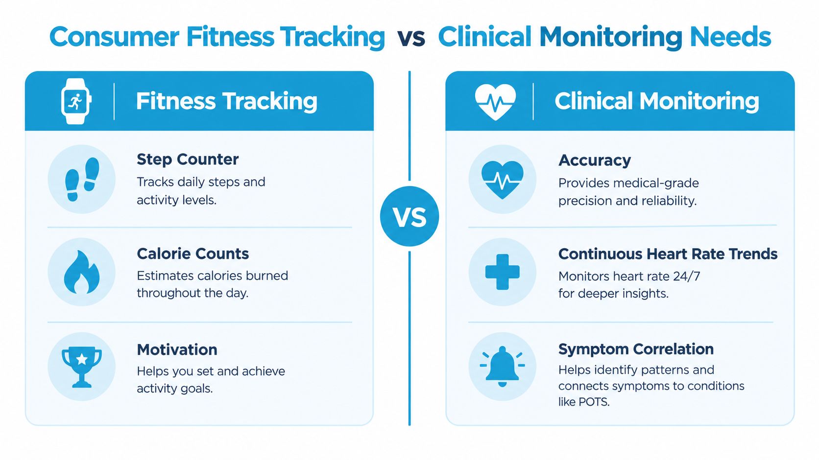
A fitness app is usually built to motivate movement. It highlights goals, streaks, calories, zones, and progress. For that purpose, broad summaries often work well enough.
Clinical review asks something narrower and stricter. It needs timing, duration, context, and a clear rule for what counts as an event. Those aren't the same job.
The same spike can mean different things
Suppose your heart rate rises quickly.
If that happened during a brisk walk uphill, one might file it under normal exertion. If the same rise happened within minutes of standing from bed and came with dizziness or palpitations, the interpretation changes. The number may look similar on the graph, but the surrounding context is completely different.
That's why generic charts often miss orthostatic patterns. They show that your heart rate moved, but not whether the movement was tied to standing, exercise, recovery, stress, heat, or dehydration.
What fitness views often miss
For dysautonomia, useful monitoring usually needs more than a daily high and low. It often depends on whether the rise was sustained, whether it started from a meaningful baseline, and whether symptoms appeared at the same time.
A clinician-ready summary tends to need:
- A defined event rule: Not just “heart rate went up,” but the exact threshold used
- Timing information: When the event started and how long it lasted
- Context filtering: Separation of possible orthostatic episodes from workouts and recovery
- Symptom pairing: Dizziness, fatigue, brain fog, palpitations, and related notes
- Trigger tracking: Hydration, salt intake, sleep, heat, medications, and daily strain
Why summaries matter more than raw graphs
Many people show a doctor a phone graph full of peaks and think, “Surely this proves something.” Often it doesn't, because the graph lacks structure. It may not say what happened before the peak, whether the person was active, or how often the pattern repeated.
Recent work around wearables for autonomic dysfunction and POTS points in a promising direction, but authors still note the need for broader validation, better standardization, and clearer understanding of which signals are reliable enough in real-world settings for clinical action. Those themes are discussed in this wearables and autonomic dysfunction proceedings paper.
That's the useful reframing. Wearables aren't most valuable when they chase a diagnosis from one spike. They're valuable when they convert messy daily life into a filtered record a clinician can review.
Privacy and On Device Processing in Wearable Health Monitoring
People won't stick with wearable health monitoring if they don't trust where the data goes. Privacy isn't a side issue. It's part of whether the whole system feels safe enough to use consistently.
For many users, the most comfortable model is simple: collect data on the watch, analyze it on the phone, and share only what they choose to share. That setup reduces the number of places sensitive information travels.
What on-device processing means in plain language
On-device processing means your phone handles the analysis itself instead of sending raw data to a remote server for interpretation. That can lower exposure because fewer copies of your information are moving around outside your own account ecosystem.
Read-only permissions matter too. If an app only reads from your health data source, it can't push edited data back in and reshape the original record. That creates a cleaner boundary.
If you want a practical breakdown of the privacy questions worth checking, this article on health data privacy covers the basics in plain language.
A simple trust checklist
Before you rely on any wearable workflow, check a few things:
- Where analysis happens: If possible, prefer processing that stays on your own device
- What permissions are requested: Read-only access is different from broad write access
- How syncing works: Some systems keep syncing within your own cloud account rather than a separate vendor database
- What you share: A PDF summary sent to a clinician is very different from open-ended continuous access
- Whether you can stop easily: Good privacy also means you stay in control if you want to pause, delete, or revoke access
The safest data practice isn't “share nothing.” It's “share deliberately.”
Privacy and usefulness can work together
Some people assume privacy and helpful summaries are in conflict. They don't have to be. A well-designed system can keep analysis local, summarize trends clearly, and let you choose when to export a report for clinical review.
That selective sharing is especially useful for dysautonomia. You may not need to hand over months of raw minute-by-minute data. A focused summary of episodes, symptoms, and trends often serves the clinical purpose better while exposing less.
How Apple Watch and Cardiogram Add Clinical Value for POTS
A familiar POTS problem looks like this: you stand up, your heart races, you feel lightheaded, and by the time you try to show someone the graph later, the important moment is buried inside a long day of normal activity. Clinical value comes from pulling that moment out of the clutter and turning it into a clear episode summary.
That is where Apple Watch heart-rate tracking becomes more useful for dysautonomia. The watch collects many small signals over time. The useful part is not the single reading on your wrist. The useful part is the running record, especially after software filters out exercise and groups the remaining changes into patterns a clinician can review.
What a usable episode summary looks like
For orthostatic symptoms, a helpful summary works like a highlighted passage in a textbook. Instead of rereading the whole chapter, you can go straight to the lines that matter.
In practice, that means capturing a starting heart rate, the rise after standing, the peak, how long the increase lasts, and when it happened. It also helps to note whether the event happened outside a workout or recovery period. Without that filtering, standing-related tachycardia can disappear into the noise of a normal day.
Turning raw heart rate into a clinician-ready record
Cardiogram uses read-only Apple Health data from Apple Watch to identify episode patterns such as heart-rate rises that fit a defined threshold within a short time window. It can log the baseline, peak, duration, and time of the event in an episode feed. It can also send phone alerts during episodes, connect symptoms and triggers such as dizziness, palpitations, fatigue, brain fog, hydration, salt intake, sleep, and medications, exclude workouts and recovery periods from episode counts, and export a PDF that states the detection criterion used for review.
That changes the role of the wearable. Instead of acting like a diagnosis machine, it acts more like a context engine. It keeps a longitudinal record, filters it, and turns repeated episodes into a format that is easier to discuss during care.
A 2025 study on patient perspectives in POTS reported that people saw value in continuous monitoring for pacing and symptom awareness, while also describing a gap in practical guidance for interpretation and day-to-day use. You can read that in the patient perspectives research on wearables in POTS.
Why this helps in clinic without claiming diagnosis
A single spike rarely answers much. A pattern often does.
For POTS and related dysautonomia, clinicians usually need context across time. They need to know whether episodes cluster in the morning, whether they follow poor sleep, whether hydration or salt changes seem to matter, and whether some apparent events are better explained by activity. A filtered episode log is much better suited to those questions than a phone screenshot of one dramatic moment.
That is the clinical value. Apple Watch plus Cardiogram can turn scattered symptoms and noisy heart-rate traces into a longitudinal record with enough structure to support a more grounded conversation about what keeps happening, when it happens, and what may be shaping it.
Putting Wearable Health Monitoring to Work for You
The best use of wearable health monitoring is usually calmer and more practical than people expect. It's less about catching a magic number and more about building a record that reflects real life.
A simple way to use your data well
Start with consistency. Wear the device regularly enough that the pattern has a chance to appear. If you only check when you feel bad, your record will be patchy and harder to interpret.
Then add context. If you feel dizzy, log whether you had just stood up, whether you slept poorly, whether fluids or salt were off, and whether you were exercising. Those details often matter more than another decimal place on the graph.
When to watch and when to share
Use the data for self-awareness when it helps you notice trends, pace your day, or connect symptoms with routines. Bring a summary to a clinician when episodes are recurrent, disruptive, unclear, or changing in a way that needs medical review.
Keep your expectations realistic:
- Don't overread one spike: Isolated readings can be noisy
- Prefer patterns over peaks: Repeated episodes tell a stronger story
- Filter out obvious exercise: Not every rise is clinically meaningful
- Review privacy settings: Know who can access what
- Bring summaries, not chaos: A clean report is easier to discuss than a crowded phone screen
Wearables are most useful when they reduce ambiguity instead of adding more of it. For POTS and dysautonomia, that usually means filtered trends, episode timing, and symptom-linked summaries that help you and your clinician talk about the same events.
If you're using Apple Watch data to understand dizziness, tachycardia, or suspected orthostatic episodes, Cardiogram helps turn that raw history into structured events, trend views, and clinician-ready summaries. It's designed for people who need more than a fitness graph and want a clearer way to connect heart-rate changes with symptoms, triggers, and appointments.