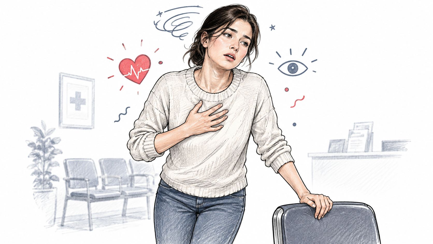
You stand up from the couch, walk a few steps, and suddenly your heart feels like it's sprinting ahead of you. Maybe you get dizzy. Maybe your vision goes gray for a second. Maybe you lean on the kitchen counter and think, “I need to remember this for my appointment.”
Then the day keeps moving.
By the time you talk to a clinician, the moment is blurry. Was it before breakfast or after? Had you slept badly? Were you dehydrated? Did it happen after climbing stairs, or after standing still? People don't forget because they're careless. They forget because symptoms happen in real life, not in neat little medical snapshots.
That's where a chronic illness symptom tracker becomes useful. Not as a glorified diary, but as a way to turn scattered moments into evidence. When symptoms rise and fade quickly, memory isn't enough. A good tracker helps you capture timing, body signals, and context so you can stop relying on vague phrases like “I feel bad sometimes.”
Introduction to Smarter Symptom Tracking
A lot of people start tracking with random notes. A screenshot here. A note in the phone there. Maybe a photo of a smartwatch graph with no explanation attached. It feels better than nothing, but it often creates one more problem: a pile of disconnected clues.
Smarter tracking works differently. It treats symptoms like events that can be measured, described, and reviewed. Instead of asking yourself to remember every episode, it builds a timeline. That timeline becomes much more useful when it follows clear rules, especially for conditions with heart-rate changes and position-related symptoms.
A lot of digital tools now include self-tracking because it has become a core part of chronic illness management. A systematic review found that 64 of 98 mobile health services, or 65.3%, included self-tracking features, and a separate study found that about 59.8% of people with chronic conditions reported having mobile health apps on their tablets or smartphones (systematic review details). That matters because it shows symptom tracking isn't a niche hobby anymore. It's a normal part of how many patients manage recurring symptoms over time.
Why scattered notes fail
The biggest issue with casual symptom logging is that it usually captures feelings without enough structure. “Felt awful this morning” may be true, but it doesn't tell you or your clinician what happened around that moment.
A stronger record usually answers questions like:
- When it started: Did symptoms begin right after standing?
- What your body did: Was there a noticeable heart-rate rise?
- What may have influenced it: Sleep, hydration, heat, meals, stress, medications.
- How long it lasted: A few minutes matters differently than a lingering pattern.
If you're exploring digital health solutions for ongoing symptom monitoring, this shift is the key one to understand. The goal isn't to create more work. The goal is to make each tracked episode count for something.
You're not trying to prove that you feel bad. You're trying to show when, how, and under what conditions symptoms happen.
What a Chronic Illness Symptom Tracker Actually Does
A good tracker acts less like a notebook and more like a flight recorder. A notebook catches whatever you happen to write down. A flight recorder keeps a running record so people can understand what happened before, during, and after an event.
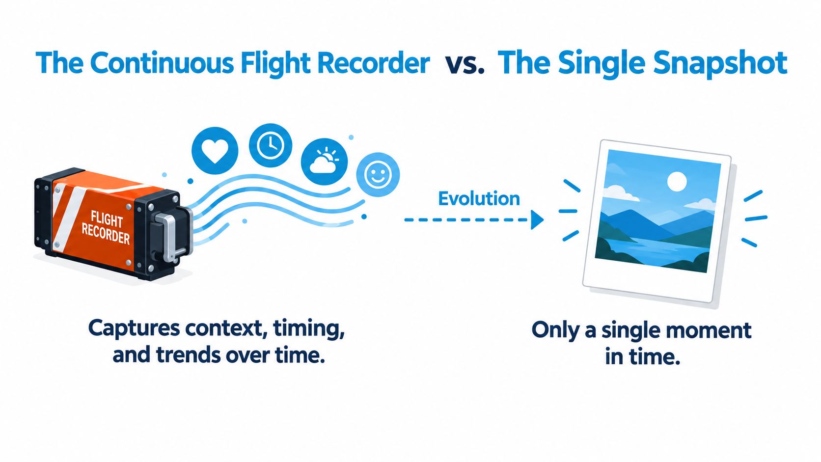
That difference matters for chronic illness. A single heart-rate graph can show one spike. It usually can't tell the whole story. A chronic illness symptom tracker connects the spike to your symptoms, your position, and what was happening around that time.
The three jobs of a useful tracker
First, it detects meaningful changes.
This is the body-signal part. Instead of showing only raw data, it helps flag moments that deserve attention.
Second, it adds human context.
Data without context can mislead you. A fast heart rate during a workout means something different from a fast heart rate while standing still after waking up. Context includes things like hydration, sleep, heat exposure, meals, and medication timing.
Third, it summarizes patterns over time.
One episode can be upsetting. A pattern is what makes the episode medically useful. Trends across days or weeks can show whether symptoms cluster in the morning, after poor sleep, or during hotter days.
What makes it different from a general wellness log
A basic wellness app often asks broad questions like mood, energy, or exercise. That can still help, but illness-focused tracking usually needs more structure.
Look for a tracker that can do things like:
- Timestamp events clearly: Symptoms blur fast. Exact timing helps.
- Link symptoms to a body change: Dizziness attached to a heart-rate rise is more informative than either one alone.
- Capture likely triggers: Standing, showering, heat, missed meals, dehydration, and poor sleep often matter.
- Create shareable summaries: A clinician can review a concise pattern report more easily than dozens of screenshots.
If you've ever looked at heart rate trends over time, you've already seen the raw material. The tracker's real job is to organize that raw material into something readable.
Practical rule: If your tracker only gives you a graph, you still have to do the detective work yourself.
That's why people often get stuck. They have data, but they don't yet have a story. A well-designed tracker helps translate “my watch showed something weird” into “my symptoms tend to happen after standing in the morning, especially when I've slept poorly and haven't hydrated yet.”
Why Tracking Matters for POTS and Dysautonomia
You stand up to make breakfast, and within minutes your heart is racing, your head feels light, and you need to lean on the counter. By afternoon, the same thing may barely happen at all. That swing is one reason POTS can be hard to describe clearly in a short appointment.
POTS is common enough that many people are trying to explain these episodes, yet the pattern can still be missed if the record is vague. Older consensus literature estimated prevalence around 0.2%, and broader reviews describe a wider range while noting that more than 500,000 people in the United States may be affected (review summary and consensus details). A notebook full of “felt bad” entries rarely shows enough detail to make those episodes medically useful.
Why criteria matter more than memory
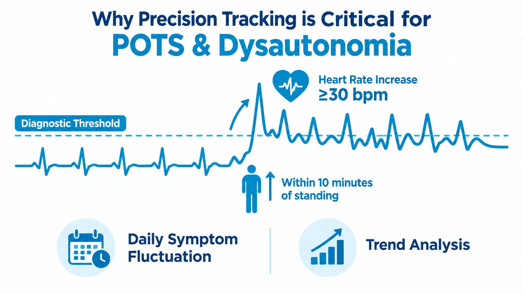
POTS is defined by a specific pattern, not just by having a fast heart rate. Consensus diagnostic statements describe it using a sustained heart-rate rise after standing, along with ongoing symptoms and exclusion of other causes (Canadian Cardiovascular Society statement and review31550-8/fulltext)). That is why symptom tracking works best when it acts less like a diary and more like evidence building.
A good record answers practical questions a clinician would ask. What was your heart rate before you stood up? How much did it rise? How long did the change last? Did dizziness, palpitations, nausea, or brain fog appear at the same time?
Those details turn a hard-to-explain moment into something testable.
Why exercise noise can confuse the picture
Heart rate goes up for many normal reasons. Climbing stairs, carrying groceries, rushing out the door, or finishing a workout can all create spikes that look dramatic on a graph. For POTS, those spikes are not equally useful.
A helpful tracker separates upright, likely orthostatic episodes from ordinary exertion. It works like sorting laundry before washing. If workout spikes, recovery periods, and standing episodes all get tossed into one pile, the pattern you need becomes harder to see.
That filtering matters because POTS is tied to context. A rise after standing still for several minutes tells a different story than a rise during exercise.
Why repeated patterns matter more than one impressive number
Many people hope for one screenshot that explains everything. POTS usually does not work that way. Symptoms can change with hydration, heat, sleep, meals, stress, and time of day.
One clinic reading may look fairly normal. A week of home tracking may show that episodes cluster after showers, on hot mornings, or after missed fluids. That kind of repeat pattern is often more persuasive than a single high number because it shows the same body response happening under similar conditions.
For people trying to understand dysautonomia heart-rate patterns, this is the shift that matters. You are not collecting random numbers. You are building a criterion-based record that shows when symptoms begin, what likely triggered them, and whether the same sequence keeps repeating.
What useful tracking captures for POTS
If your goal is a clinician-ready summary, the most useful entries usually capture:
- Position change: lying down, sitting, standing, or prolonged upright time
- Baseline and rise: where heart rate started and how much it increased
- Timing: how quickly symptoms began and how long they lasted
- Symptoms paired to the episode: dizziness, shakiness, palpitations, fatigue, brain fog, nausea
- Trigger clues: heat, showering, dehydration, poor sleep, meals, long standing
- Noise to filter out: exercise, stair climbing, and recovery after exertion
A better tracking question is: “Did this episode match the pattern clinicians look for, and did it happen in a repeatable context?”
That is why tracking matters so much for POTS and dysautonomia. It helps you sort signal from noise, connect triggers to episodes, and bring a clearer summary into care instead of a stack of disconnected notes.
Must Have Features in a Chronic Illness Symptom Tracker
You stand up after breakfast, feel your heart race, and try to remember the details later that night. Was it after a hot shower, not enough fluids, a poor night of sleep, or a true upright episode that fits a POTS pattern? A useful tracker helps answer that question while the event is still clear, then organizes it into evidence you can use.
That is the standard to look for. A chronic illness symptom tracker should do more than store notes. It should help you separate likely orthostatic episodes from exercise noise, connect symptoms to trigger clues, and turn scattered moments into a summary a clinician can review quickly.
Feature Checklist for POTS-Focused Trackers
| Feature | What It Does | Why It Matters for POTS |
|---|---|---|
| Criterion-based episode detection | Flags events using a defined heart-rate rise rule instead of vague “high HR” moments | Keeps the focus on standing-related patterns instead of random spikes |
| Baseline, peak, and duration capture | Records where HR started, how high it went, and how long it remained high | Gives more useful evidence than a single maximum number |
| Symptom logging tied to episodes | Lets you attach dizziness, palpitations, fatigue, brain fog, and similar symptoms to a specific event | Connects body data to lived experience |
| Trigger logging | Tracks hydration, salt, sleep, heat, meals, medications, and other likely influences | Makes repeat patterns easier to spot over time |
| Context-aware filtering | Excludes workouts and recovery periods from episode counts | Cuts down false positives from normal exertion |
| Real-time alerts | Tells you when a likely event is happening | Helps you respond in the moment and record context while it is still fresh |
| Weekly summaries and heatmaps | Shows when episodes cluster across days and times | Makes recurrence easier to see |
| Clinician-ready export | Creates a summary you can share at visits | Saves appointment time and makes the record easier to review |
| Read-only health data access | Pulls from existing watch and phone health data without writing back to it | Supports privacy and cleaner control of the original record |
| Longitudinal history | Keeps older data available for review | Helps when symptoms change over weeks or months |
Features that lower your workload
A good tracker works like a short form you do not have to build yourself each day. It should catch the event, ask for a few key details, and keep the record structured enough that you can review it later without decoding your own notes.
Look for details that reduce effort on hard days:
- Automatic episode creation: likely events are logged without you having to notice every one in real time.
- Simple context prompts: quick taps for fluids, sleep, meals, heat, or medication are easier to keep up with than long written entries.
- Clear review screens: weekly or daily views should make patterns visible without requiring spreadsheet-style work.
- Built-in noise filtering: stair climbing, workouts, and recovery should not be counted the same way as possible orthostatic episodes.
Features that make reports more useful in care
A clinic visit usually goes better with a pattern summary than with a camera roll full of screenshots. The report should show the rule used to identify events, when they happened, what symptoms appeared, and which trigger clues showed up around them. That gives your clinician something closer to a case summary than a diary.
One example is Cardiogram, which uses read-only Apple Health data from Apple Watch, detects 30+ bpm rises within 5 minutes, links symptoms and triggers to episodes, excludes workouts and recovery from counts, and can generate a PDF summary with the stated detection criterion. The value is not the graph by itself. The value is that the graph, symptoms, and context are kept together in a format that supports clinical review.
A stronger report shows how an episode met the rule, what symptoms came with it, and what was happening around it.
Privacy features should be specific
Privacy matters for health tracking because you are recording routines and vulnerable moments. A symptom log can reveal when you are home, when you sleep poorly, when you miss meals, when symptoms interrupt work, and how often episodes happen.
Useful privacy features include:
- On-device analysis: processing happens on your phone instead of sending every step elsewhere.
- Read-only integration: the app can read health data without changing the source record.
- Account-level control: your information stays inside your own device and health account structure as much as possible.
The right feature set should make symptom tracking feel lighter, not heavier. If a tracker helps you collect criterion-based episodes, filter out exercise noise, and produce a clean summary, it is doing more than logging symptoms. It is helping you build evidence.
How to Choose the Right Tracker for Your Needs
Choosing a chronic illness symptom tracker gets easier when you stop asking, “Which one has the most features?” and start asking, “Which one fits the way my symptoms happen?”
A person who mainly forgets patterns needs something different from a person who needs real-time alerts. A person who worries about data privacy will choose differently from someone who mostly wants easy visit summaries.
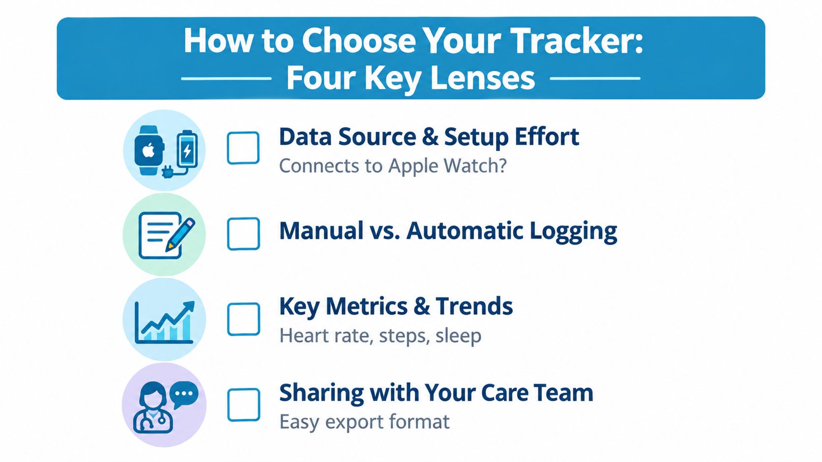
Use four lenses
Start with your data source.
If you already wear an Apple Watch, a tracker that works with existing health data usually creates less friction. You don't want a complicated setup if your real problem is low energy and inconsistent symptom days.
Think about logging effort.
Some people can manage short daily check-ins. Others need a tool that does most of the work automatically and only asks for brief context when an episode appears.
Check how it handles noise.
This is a big one for POTS. If a tracker can't distinguish exercise-related heart-rate changes from likely orthostatic episodes, you may end up with a confusing record that overcounts the wrong moments.
Look at shareability.
If your end goal is a better clinic conversation, make sure the tracker can export a concise summary. A clean report often works better than scrolling through apps during an appointment.
Questions worth asking before you commit
Use a short checklist before you settle on anything:
- Will it work on day one with the data I already have?
- Does it rely on constant manual logging?
- Can it filter workout and recovery periods?
- Can I review trends over weeks, not just today?
- Can I export something a clinician can read?
- Are the membership terms clear and easy to understand?
If using the tracker feels like another chore you'll avoid on a symptom-heavy day, it's probably the wrong fit.
The right choice often feels boring in the best way. It fits into your routine, catches useful events, and doesn't ask you to become a spreadsheet manager just to understand your own body.
Example Workflows That Turn Data Into Insights
Tracking becomes much easier when you can picture what daily use looks like. Not in theory. In real life.
Workflow one for the day symptoms happen
You wake up tired, stand up from bed, and your heart rate rises quickly. The tracker notices a criterion-matching episode and records the time, baseline, and peak. You get an alert while it's still happening, not hours later when the details are fuzzy.
You add two quick notes: poor sleep and low hydration. Maybe you also mark dizziness and brain fog. That takes less energy than writing a paragraph, but it captures the part a graph can't know on its own.
Later that day, the event is still there in your episode list with context attached. You didn't have to reconstruct it from memory.
Workflow two for the weekly review
At the end of the week, you stop looking at individual episodes and start looking for shape. Are mornings worse? Do events cluster after hot showers? Do symptoms pile up after several nights of poor sleep?
A weekly review can help you notice things like:
- Timing patterns: Episodes keep showing up in the first part of the day.
- Trigger links: Lower hydration days line up with rougher episodes.
- Noise reduction: Workout periods are absent from the count, so the list feels more believable.
- Trend direction: Resting heart-rate shifts or episode clustering may point to a rough week versus a steadier one.
“I thought my symptoms were random. Then I saw they were happening in the same situations over and over.”
That moment matters. It shifts you from feeling ambushed by your body to recognizing a pattern you can describe.
Turning review into something you can share
When a visit is coming up, the final step is to turn those patterns into a short summary. A good report doesn't need dramatic language. It needs clear evidence.
A useful summary usually includes:
- How episodes were detected
- When they tended to happen
- Which symptoms appeared most often
- What context showed up repeatedly
- Whether the pattern changed over time
Unlimited history, linked symptom logs, and a clinician-ready PDF become more than convenience features. They help you move from “I don't know how to explain it” to “here's the pattern I've been seeing.”
Start Tracking With Confidence and Clarity
The biggest mindset shift is simple. Symptom tracking works best when it stops being a memory exercise and starts becoming criterion-based evidence building.
That doesn't mean you need perfect data. You don't.
It means you need a repeatable habit that catches likely episodes, adds enough context to make them understandable, and filters out noise that would muddy the picture. For POTS, that often means focusing on standing-related changes, symptom pairing, trigger notes, and weekly review instead of chasing every strange body sensation all day.
A simple way to begin
Start smaller than you think you need to.
- Track likely episodes consistently: Let the app do as much automatic capture as possible.
- Log two pieces of context: Hydration and sleep are a good starting pair.
- Review once a week: Patterns appear over time, not in a single frustrating day.
- Bring a summary to your next visit: A concise record is easier to discuss than a phone full of screenshots.
If you miss a day, that doesn't ruin the process. If one week looks messy, that's still data. The goal isn't to create a flawless personal lab. The goal is to notice what repeats.
Your body doesn't need a perfect narrator. It needs a reliable record.
When tracking feels manageable, you're more likely to keep doing it. And when you keep doing it, the pattern often gets clearer than you expected.
Cardiogram helps turn Apple Watch heart-rate data into structured episode tracking for people dealing with POTS, dysautonomia, palpitations, and dizziness. It combines automatic detection, symptom and trigger logging, noise filtering for workouts and recovery, and clinician-ready summaries so your data is easier to understand and share. If that sounds like the kind of support you need, visit Cardiogram.