
You stand up to make breakfast, feel your heart begin to race, and glance at your Apple Watch. The number is higher than expected. Later, you open Apple Health and find pages of readings, timestamps, workouts, sleep records, and resting-heart-rate charts. The data is there, but the pattern that matters, what happened after standing, how long it lasted, and whether symptoms appeared with it, is difficult to see.
That's the central challenge of Apple Health analytics. The watch can collect a valuable longitudinal record, but raw measurements aren't the same as an explanation. Used carefully, those measurements can help you identify repeatable patterns and bring clearer information to a clinician. They can't diagnose POTS on their own, and they shouldn't replace medical assessment, but they can make an otherwise vague history more concrete.
Why Raw Heart Data Feels Overwhelming
A person with unexplained palpitations often starts with a simple question: “What was my heart doing when I felt that?” Apple Health may contain the answer somewhere, but finding it can feel like searching through a diary written in timestamps. A high reading might appear beside a workout, a stressful moment, a poor night of sleep, or an ordinary change from sitting to standing.
The problem isn't that you have too little information. You may have more measurements than you can interpret comfortably. Apple Health is primarily a repository that gathers records from devices and apps. It presents useful charts, but it doesn't automatically turn every cluster of heart-rate readings into a clinically meaningful episode with context and an explanation.
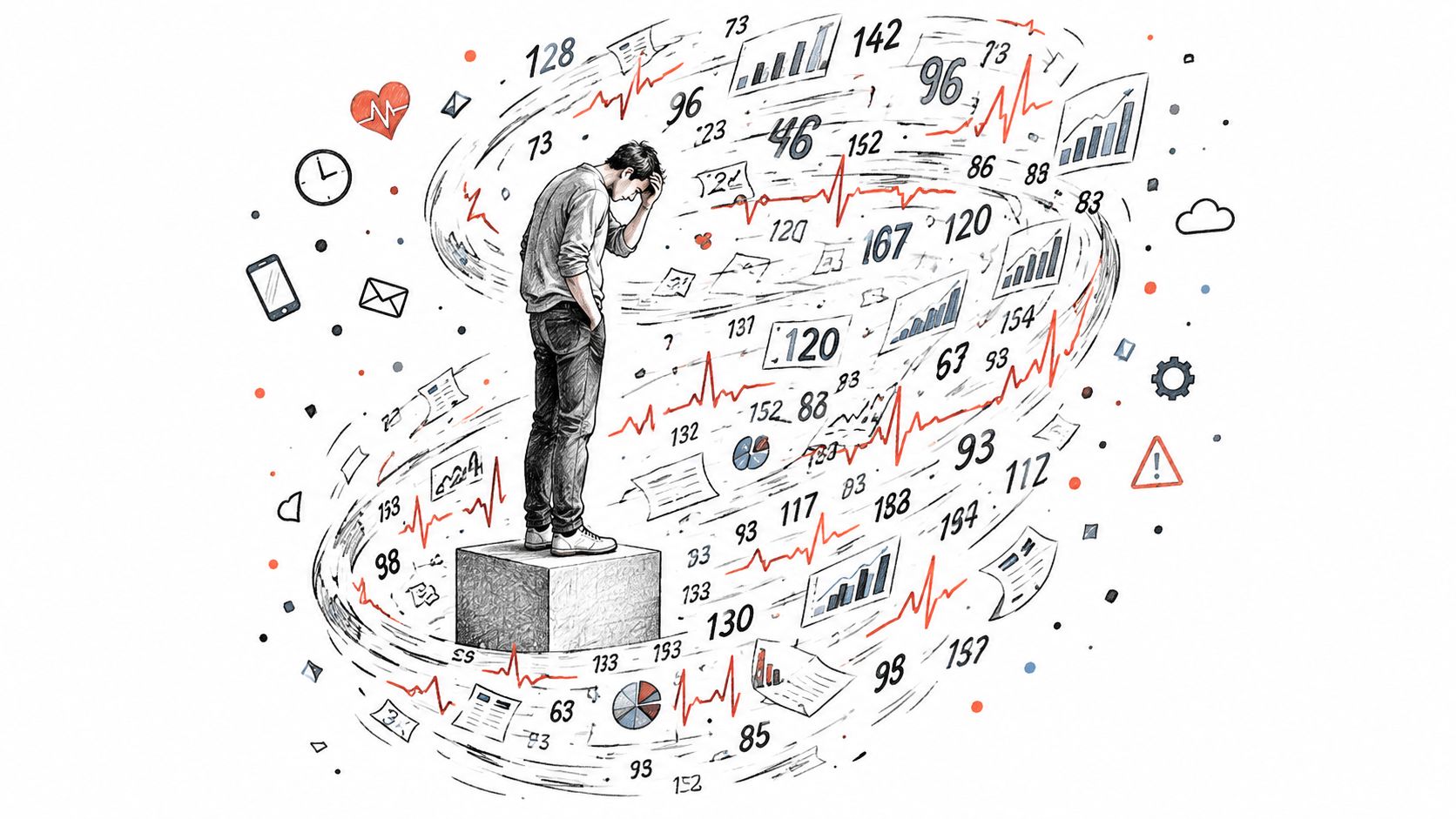
The missing layer is interpretation
Recent coverage describes Apple Health as a place where users often need third-party analysis to make sense of long-term records, while Apple's roadmap is moving toward more personalized insights and readiness-style interpretation. That direction highlights a practical gap in the current experience: many people can see their data, but still don't know what action or question should follow from it. Recent discussion of Apple Health's interpretation gap makes this distinction especially clear.
Consider two readings that look identical on a chart. One may follow brisk activity. The other may occur after a period of stillness, rise from a personal baseline, continue for several minutes, and coincide with dizziness or palpitations. A generic graph shows the heart rate. Clinical interpretation depends on the sequence and the surrounding circumstances.
What a useful episode contains
A meaningful record should answer more than “How high did the number go?” It should preserve:
- Starting point: What was the heart rate before the change?
- Magnitude: How large was the increase?
- Timing: When did the change begin, and when did it settle?
- Duration: Did the rise persist, or was it a brief fluctuation?
- Context: Were you exercising, recovering, dehydrated, unwell, or standing?
- Symptoms: Did dizziness, fatigue, brain fog, or palpitations occur at the same time?
That structure turns a confusing chart into a question your clinician can evaluate. It also protects you from overreacting to one isolated value. A single high number is an observation. A repeated, contextualized pattern is evidence worth discussing.
How Apple Watch Heart Rate Sampling Actually Works
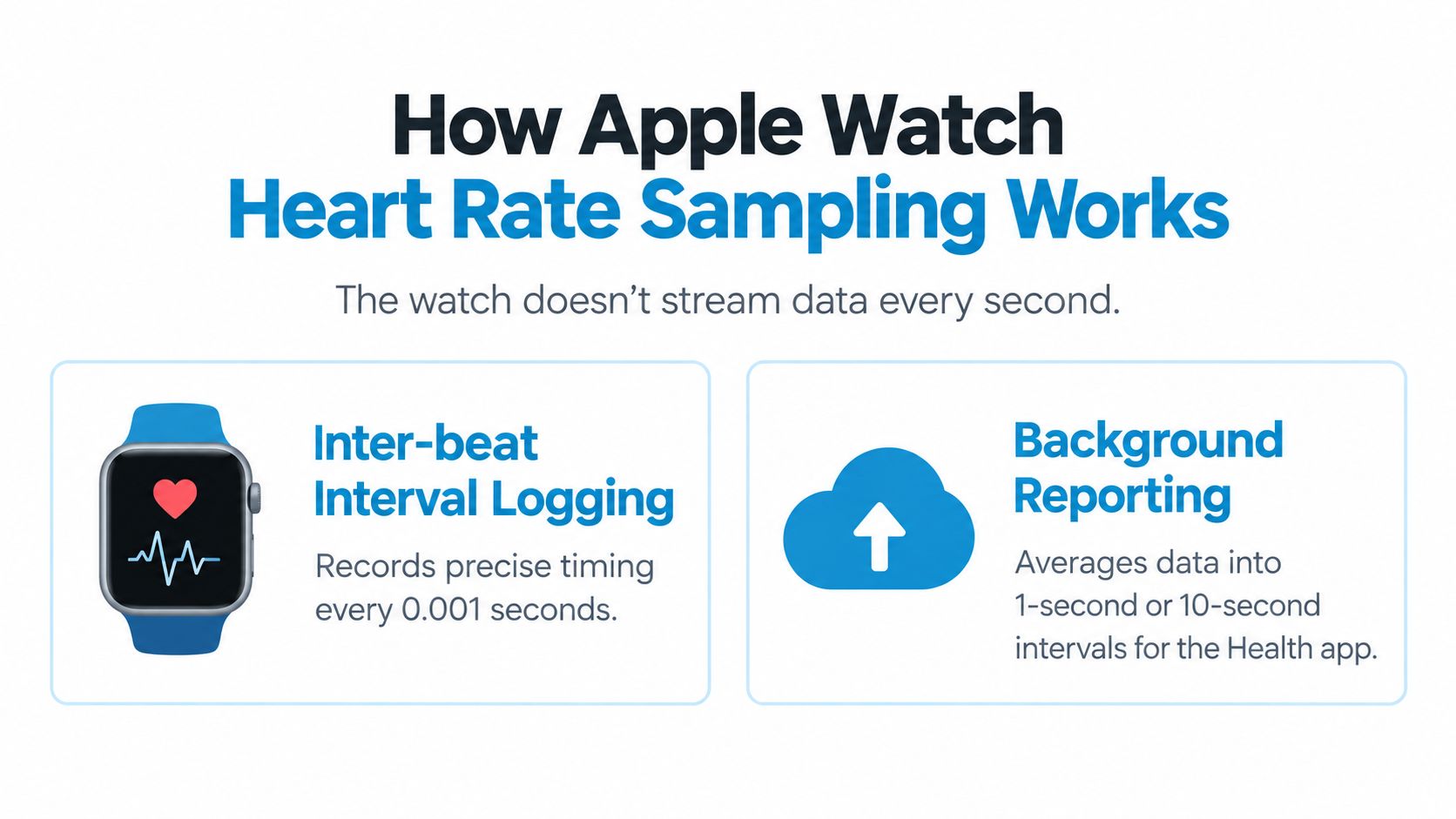
Before interpreting a trend, understand how the watch records it. Apple Watch heart-rate data in HealthKit-backed workflows isn't necessarily a continuous stream of one new value every second. Apple's 2026 heart-rate accuracy study notes that the highest-frequency user-published value is a single heart-rate datapoint every 5 seconds in the watch-face complication background stream and in the Workout app during activity. Apple's heart-rate accuracy study explains why the timing of each sample matters.
That gap changes how you should read a graph. If your heart rate rises and stays high, the samples can show the overall movement. If a spike lasts less than the sampling interval, the watch may not capture it fully, or the chart may make it appear smaller than it was.
Read the stream as a pattern
Use this simple sequence when reviewing a suspected event:
- Find the time window. Start with the moment you noticed symptoms, then look before and after it rather than focusing on the peak alone.
- Identify the baseline. Ask what your heart rate was doing before you stood, walked, or felt symptoms.
- Look for persistence. Several aligned samples are more informative than one isolated value.
- Mark the context. Separate exercise, recovery, sleep, and ordinary daily activity before drawing conclusions.
- Compare episodes. Repeated timing and shape can be more useful than the highest reading in the entire record.
Apple's study reported statistically significant higher accuracy for Apple Watch than the other devices evaluated across workout and daily-living protocols. The same source also reports variability in agreement across a living meta-analysis, with overall Bland-Altman limits of agreement of roughly -7.19 to 6.64 beats per minute and an under-exercise bias around -0.63 beats per minute, with limits of agreement of -6.86 to 5.60 beats per minute. Those figures don't make the data useless. They explain why trend detection and episode clustering are safer foundations than reacting to a single point.
Why workouts need separate treatment
Exercise changes both your physiology and the recording context. During activity, heart rate is expected to rise, and the measurement conditions differ from quiet daily living. Recovery can also contain high readings that resemble an episode if an analytics system doesn't recognize what came before.
For that reason, a POTS-oriented workflow should exclude workouts and recovery periods from its episode count or label them separately. You can read more about the underlying measurement process in this explanation of how heart monitors work. The practical rule is straightforward: don't ask a chart to distinguish an autonomic event from exercise unless the workflow includes activity context.
Finding Meaningful Trends in the Noise
A standard heart-rate graph answers only one question, “What value was recorded at this time?” POTS-oriented analysis asks a more specific question: Did heart rate change in an orthostatic time window, by a clinically relevant amount, and without an obvious explanation such as exercise?
Consensus criteria commonly anchor POTS evaluation to a sustained heart-rate increase of at least 30 beats per minute within 10 minutes of standing, together with the absence of orthostatic hypotension, an appropriate symptom history, and relevant clinical context. The criterion also needs to be reproducible, and other causes of sinus tachycardia, including exercise, dehydration, medications, and acute stressors, need consideration. The consensus review of POTS criteria provides the clinical framework.
Why thresholds matter
A threshold prevents a vague definition of “high.” Without one, an analytics system might count every reading above a fixed heart rate, even though people have different baselines. It might also count an exercise interval, a brisk walk, or the recovery period afterward.
A more useful detection logic preserves the components that clinicians need:
| Element | Question it answers |
|---|---|
| Baseline | Where did the episode begin? |
| Rise | How much did the heart rate change? |
| Time window | Did the change occur after standing and within the relevant interval? |
| Sustained period | Did it remain elevated rather than appearing as one spike? |
| Exclusions | Was exercise, recovery, dehydration, medication, or stress present? |
| Symptoms | Did the person feel unwell at the same time? |
This doesn't turn a wearable into a diagnostic test. It creates a consistent way to find candidate episodes for review. That distinction matters. Automated labeling should surface patterns, not declare that a diagnosis has been established.
Separate physiology from false positives
Suppose your watch records a rapid rise while you are climbing stairs. The increase may be real, but it doesn't answer the orthostatic question. Suppose the rise occurs after poor sleep and while you feel dizzy after standing still. That event may be more relevant, but it still needs clinical interpretation and comparison with other episodes.
A useful analytics workflow therefore filters in stages:
- Remove or label workouts so expected exertion doesn't inflate the episode count.
- Mark recovery periods because heart rate may remain high after activity.
- Preserve timestamps so symptoms and posture can be compared with the data.
- Group nearby samples into an episode rather than treating every datapoint as a separate event.
- Show uncertainty when sampling is sparse or context is missing.
The best output isn't a dramatic list of peaks. It's a compact view of when episodes occur, how consistently they follow standing, what symptoms accompany them, and which confounders were present. For a plain-language guide to reading longer-term patterns, see this overview of heart-rate trends.
Building a Daily Monitoring Workflow for POTS
Good monitoring doesn't require you to record every sensation all day. It requires a repeatable habit that connects three things: what you felt, what your heart did, and what was happening around you.
Start with a simple symptom note when an event occurs. Record the approximate time and the main experience, such as dizziness, palpitations, fatigue, or brain fog. Add what you were doing, whether you had just stood up, and whether the symptoms eased after sitting or lying down.
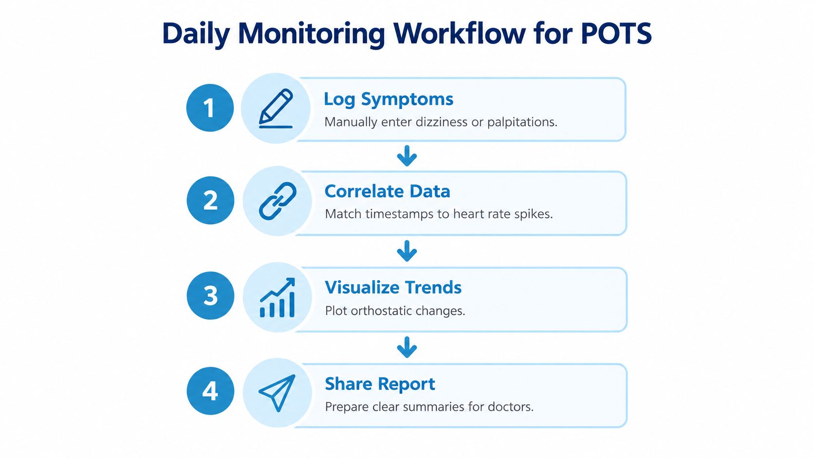
Four habits make the record useful
Log symptoms close to the event. A short note made near the time is usually more helpful than a detailed reconstruction days later. You don't need polished prose. “Dizzy after standing, heart racing, had to sit” gives a clinician more usable context than a general statement that you felt unwell recently.
Add likely triggers without assuming causation. Note hydration, salt intake, sleep, medication timing, heat, illness, and stress when relevant. These details may help explain variation, but a correlation in your personal record isn't proof that one factor caused the episode.
Review patterns at a regular interval. Look for timing across the day, repeated activities, and changes in resting heart rate. A weekly view can reveal clustering that is easy to miss when you inspect only the latest reading.
Prepare before the appointment. Select representative episodes, not every high value. Include the date, symptoms, posture or activity, the heart-rate pattern, and anything that could have affected the result.
Keep the routine small enough to sustain
Many people abandon monitoring because they try to capture too much. A practical daily record might use a few consistent fields:
| Record | What to write |
|---|---|
| Symptoms | Dizziness, palpitations, fatigue, brain fog, or none |
| Situation | Standing, sitting, walking, exercising, or resting |
| Body context | Sleep, hydration, food, heat, illness, or medication timing |
| Episode details | Approximate start, end, and whether symptoms improved with rest |
| Follow-up | Questions to ask your clinician |
Don't change medication, salt, fluid intake, exercise, or other treatment based only on a watch pattern. Bring the pattern to a qualified clinician, especially if symptoms are new, severe, or worsening. Seek urgent care for severe chest pain, fainting with injury, serious breathing difficulty, or other emergency symptoms.
The purpose of this workflow is not to make you monitor yourself constantly. It is to replace scattered memories with a structured timeline that respects both the data and your lived experience.
Keeping Your Health Data Secure and Private
Heart-rate history is sensitive. Before using any analytics service, ask where the data is processed, whether the app can write to your Health records, what leaves your device, and how account deletion works. Privacy language should describe the actual data flow, not merely use reassuring words.
A read-only integration can request permission to analyze selected Apple Health records without changing the underlying history. That limits what the app can do inside Health, but it doesn't automatically tell you whether data is uploaded elsewhere. Read-only access and on-device processing are separate properties, and you should check both.
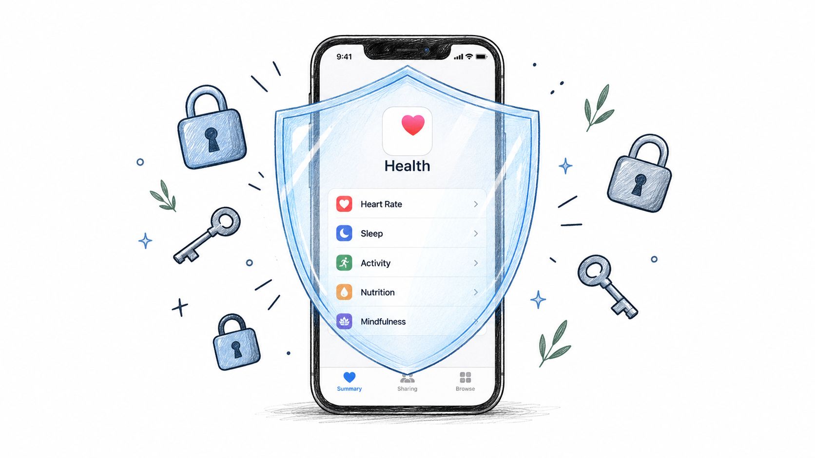
On-device versus cloud analysis
When analysis runs on device, the heart-rate records are processed by the phone or watch rather than sent to a remote analytics server for each calculation. This can reduce exposure and may allow the user to keep the raw history within the personal device ecosystem.
Cloud processing follows a different path. The app sends some or all of the data to remote infrastructure, where calculations, storage, backups, or account services may occur. Cloud systems can support access across devices, but they also introduce additional questions about retention, encryption, access controls, and deletion.
Neither approach should be accepted on trust. Read the permission screen and privacy policy, then look for clear answers to these questions:
- What is collected? Does the app request heart rate only, or also workouts, sleep, symptoms, medications, and location?
- Where is it processed? Is episode detection performed locally, remotely, or through a combination?
- What is stored? Does the provider retain raw records, derived episodes, reports, or account identifiers?
- Can data be deleted? Is there a clear process for removing synced information?
- Can access be revoked? Can you withdraw Health permissions without losing control of your Apple Health history?
A privacy-conscious design should also minimize collection. An app that needs heart rate and workout context shouldn't automatically request unrelated categories. For a deeper explanation of the questions patients should ask about sensitive records, use this guide to health data privacy.
The safest workflow is one you understand. If a product's data path is unclear, pause before granting access and ask the provider for a plain-language explanation.
Creating Clinician-Ready Reports from Your Watch
A useful report doesn't try to impress a clinician with every available measurement. It answers a focused question and makes the underlying method visible. For orthostatic symptoms, that usually means showing episode timing, baseline, peak, sustained duration, symptoms, activity context, and relevant exclusions.
Start with a date range that matches your clinical question. If you're investigating recent worsening, a recent period may be more useful than an undifferentiated lifetime history. If you're exploring a longstanding pattern, a longer view can show whether episodes cluster, change with routines, or appear alongside shifts in resting heart rate.
What the report should show
A clinician-friendly summary can include:
- Episode table: Date, time, baseline, peak, change, duration, and symptoms.
- Context labels: Standing, walking, workout, recovery, sleep, or unknown.
- Trend view: Resting heart-rate movement and episode frequency over time.
- Quality notes: Missing samples, uncertain posture, and readings affected by activity.
- Method statement: The detection rule and exclusions used to identify candidate episodes.
- Patient questions: What you want help evaluating at the appointment.
The method statement is essential. A report should not present a count without explaining how the count was produced. If the system used a rise-and-duration rule aligned with a recognized POTS evaluation framework, say so plainly, while also stating that the result is not a diagnosis.
Turn a printout into a conversation
Bring the report with a short narrative. “These episodes usually begin after standing, occur outside workouts, and often coincide with dizziness” is more useful than “my heart rate is unpredictable.” Then ask the clinician how the pattern fits with your history, examination, blood-pressure findings, medications, and other possible explanations.
A report can support care without dictating it. The clinician may decide that the data is incomplete, that a different monitoring method is appropriate, or that another condition needs evaluation. That isn't a failure of Apple Health analytics. It means the wearable record has done its proper job, providing a clearer starting point for medical reasoning.
Cardiogram can turn Apple Health heart-rate history into structured episode feeds, symptom and trigger context, trend views, and clinician-ready reports, with analysis performed on the device. If you want to organize your watch data around orthostatic symptoms rather than raw charts, visit Cardiogram and review how its workflow fits your monitoring needs.